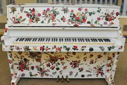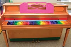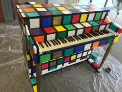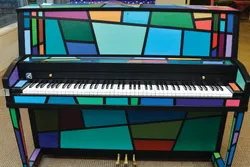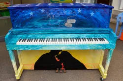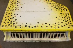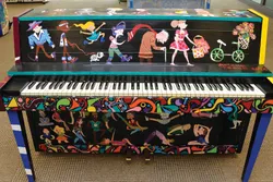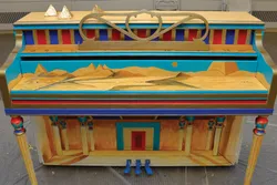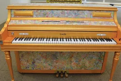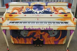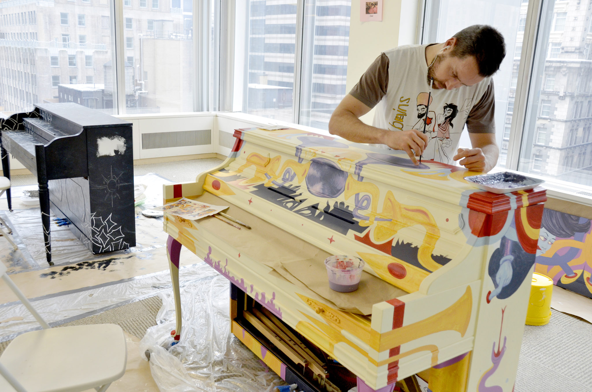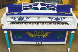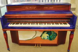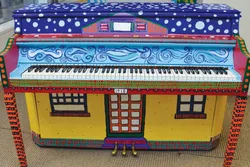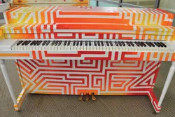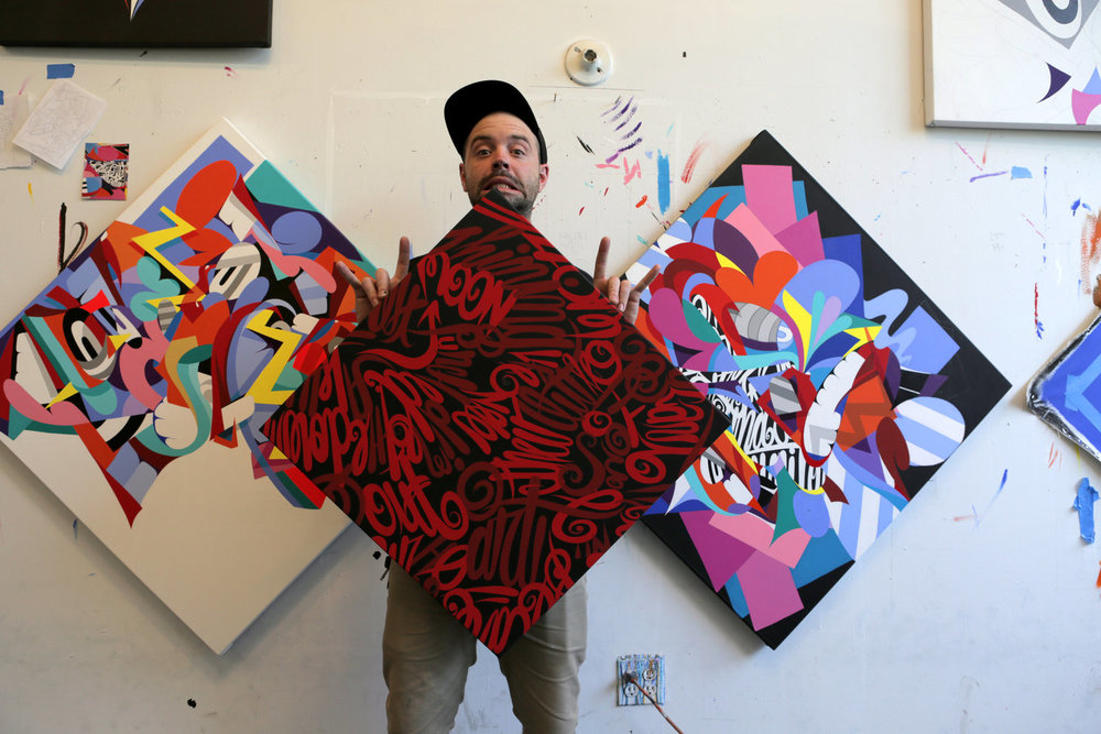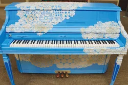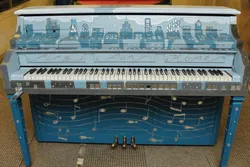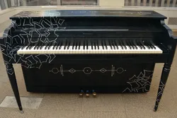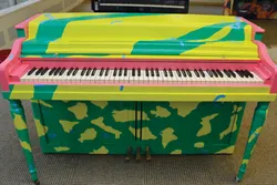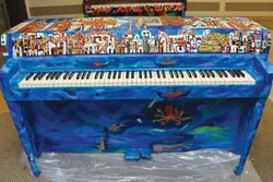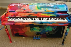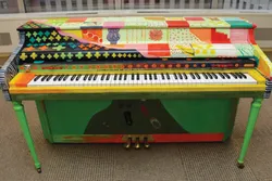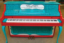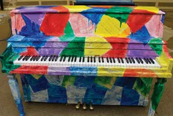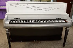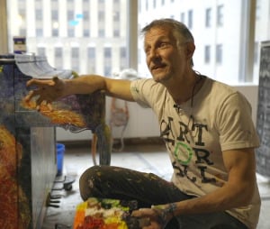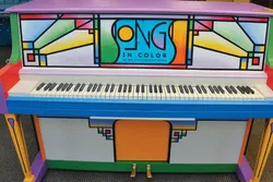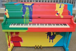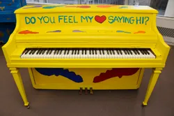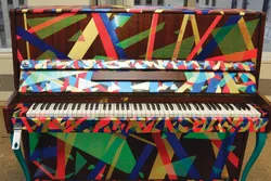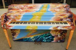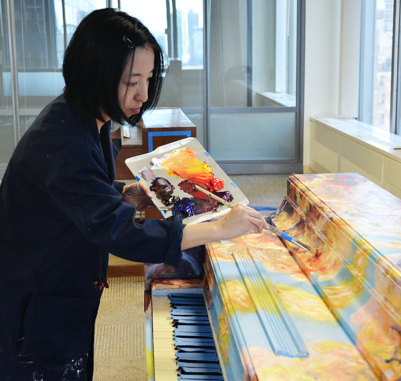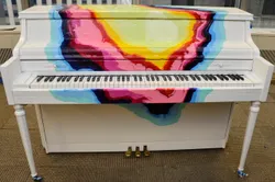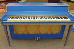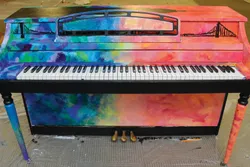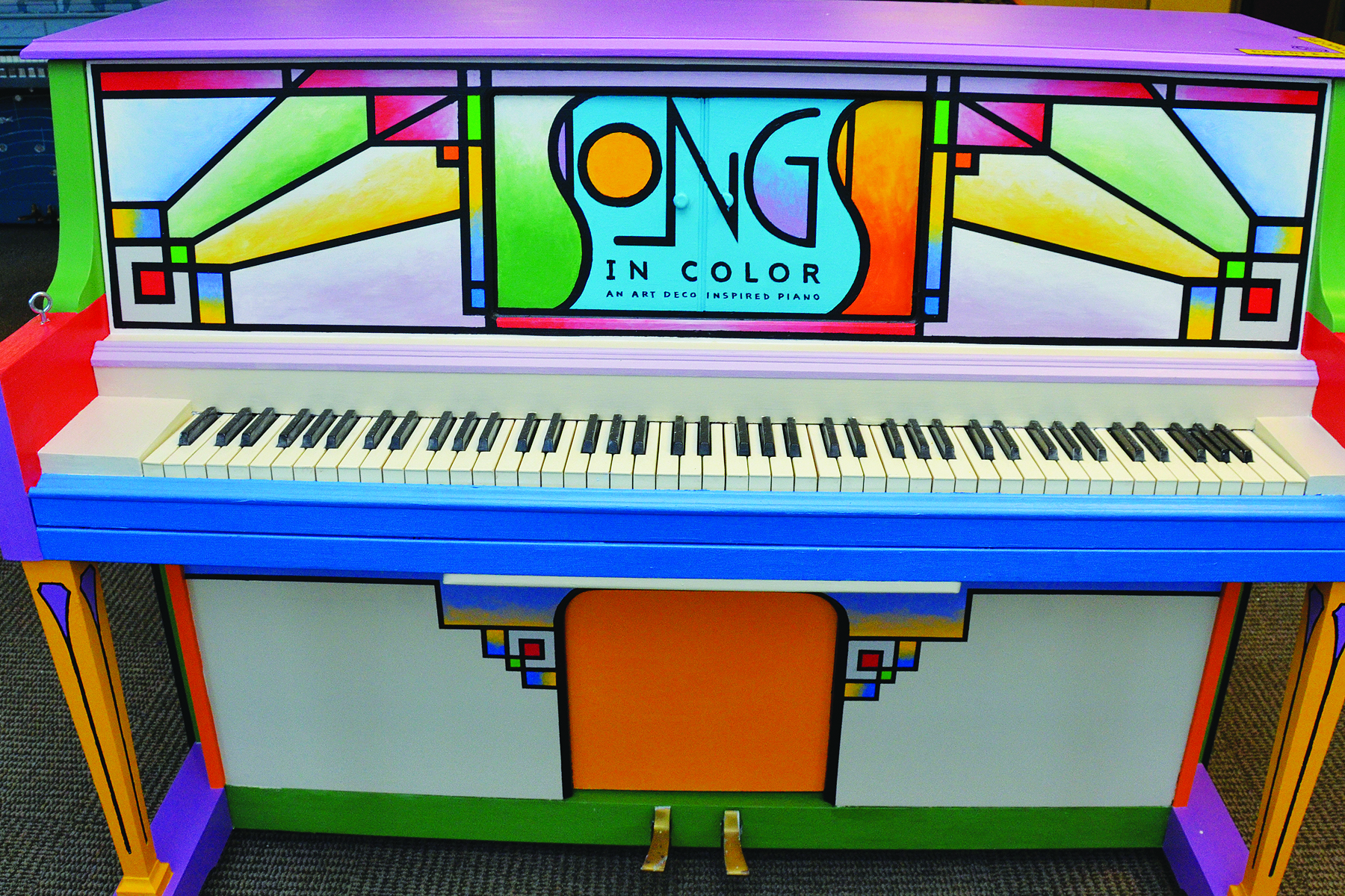
Artist Statement: This year my Sing for Hope piano is an Art Deco inspired design combining words, letter forms and typography along with colorful geometric shapes in a playful pattern that covers the entire instrument. I’ve always loved the art and design of the Art Deco era, as well as the Bauhaus and Arts and Crafts movements from the early twentieth century. And I've arranged the elements to evoke that style while communicating the joy and excitement of visual art along with music. Interspersed throughout the design are words of inspiration that I believe music and art bring to people. Its a positive message that is at the very heart of Sing for Hope’s mission. This is my fourth piano for Sing for Hope and I couldn't be more delighted to be part of this wonderful project again. When deciding what my piano's theme would be this year, I thought back to a design I had been asked to do by the Sing for Hope team for their Healing Arts Program brochure cover. I used the same art deco influenced approach, as I wanted to create something really unique that would pop with color and excitement. They were thrilled with the design and it occurred to me how nice it could be if I used the same concept, but this time expanding into an entire piano design. That’s how I developed this years offering to the project. Color is a huge part of my design, so when it came time to come up with a name for my piano, I thought the phrase “Songs in Color” to be a nice way to describe the experience of listening to this lovely instrument being played. Hopefully it will bring curiosity, fun and excitement to people of all ages when the piano debuts along with all the others in the public spaces they will be assigned to. This year I enlisted my wife Peggy as an invaluable assistant and collaborator in helping me paint it. Many hours of work went into its creation and it turned out to be a great experience we were both able to share together. Sing, play, and enjoy!

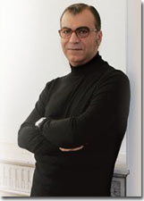
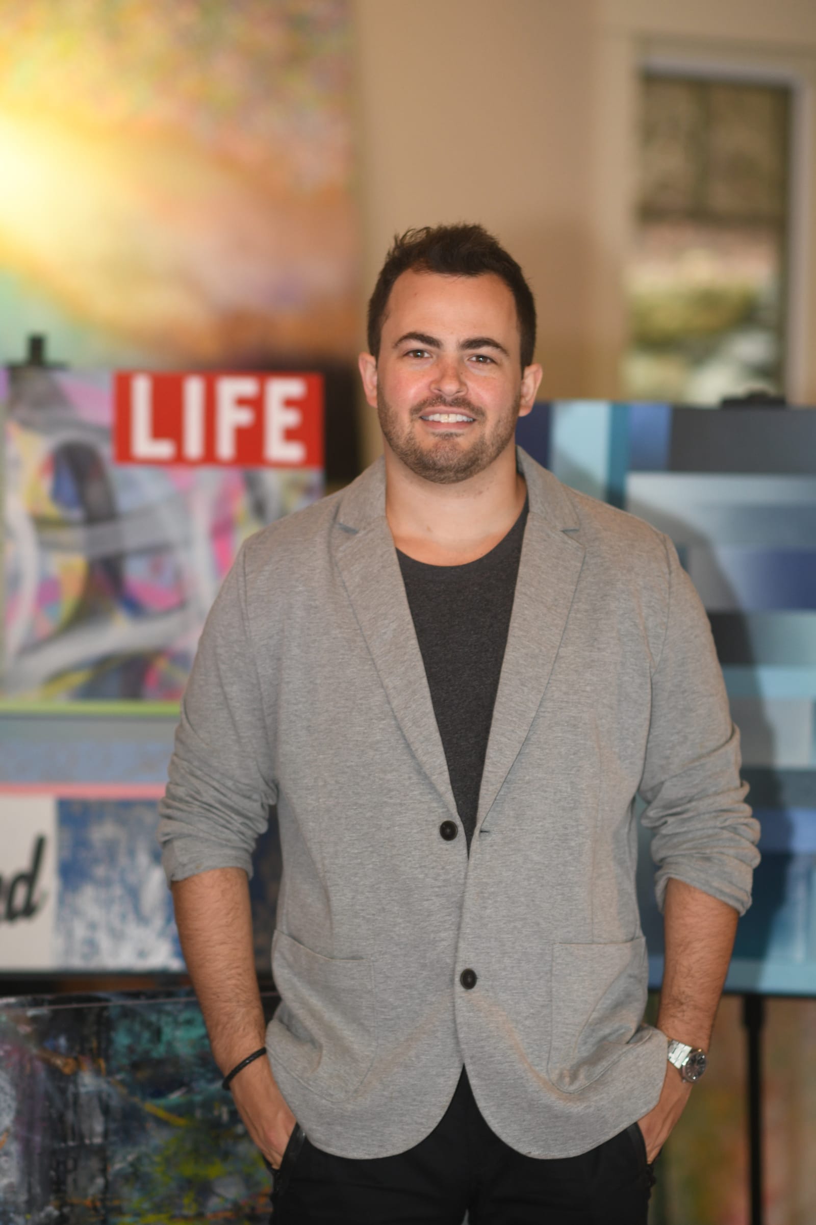
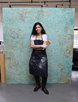
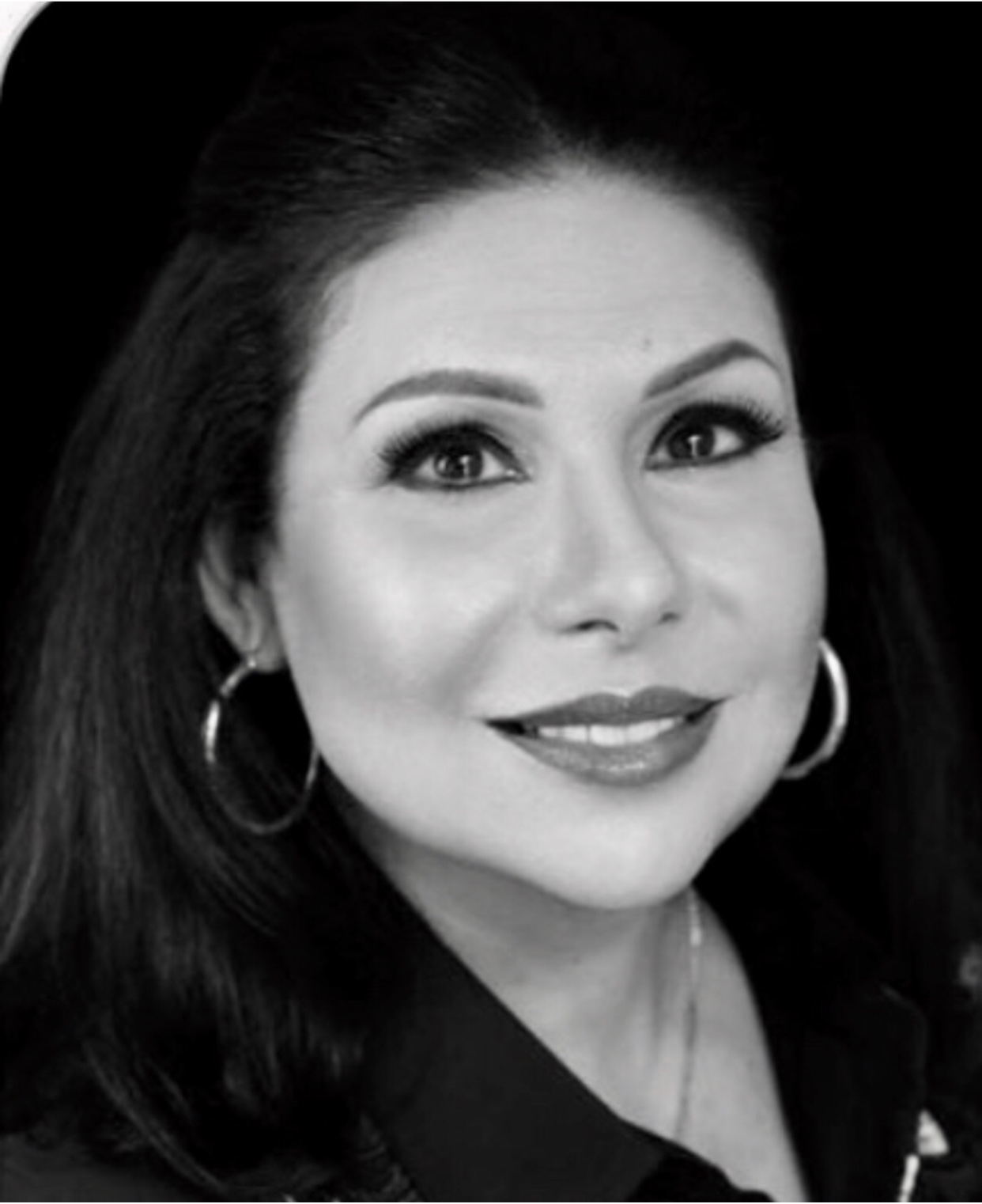
Born and raised in Brooklyn, New York, self-taught artist Robert Padovano is best known for his vibrant Impressionistic cityscapes of New York and its’ surrounding environment. His vibrant use of color and expressive brush strokes make his paintings come alive with atmosphere and light. His painting method incorporates both Impressionist and Pointillist techniques, often juxtaposing dabs of pure thick color side by side. When viewed at a distance, the eye mixes these colors to give a luminescent quality to light and shadows. Says Rob, “The look of the city inspires me to paint. Growing up in Brooklyn has had a great influence on me, especially as an artist. The city infrastructure allows for limitless complexity in color, light, and composition and are compelling subjects for an Impressionist like myself. When I paint, my goal is to capture the atmosphere around these subjects, not just the subject itself. In doing so, I hope to crystallize that moment with all its nuances of color and mood.” Recently, Robert has involved himself with other ambitious projects like Mural design and, of course, the Sing for Hope Pop Up Pianos. What I love so much about these projects is that I can combine my painting and design skills together and use them both in the creative process. Robert’s paintings are part of many private and international collections. He has exhibited at The Staten Island Museum, The John A. Noble Maritime Museum, The Newhouse Gallery of Contemporary Art, The E. Mayan Studio in New York City, Union Gallery in Lambertville, New Jersey, and many others. His work has been included in juried shows at The Salmagundi Club in New York and the American Artists Professional League. Robert attended Brooklyn College and studied design at The School of Visual Arts in New York City. He is also an award-winning graphic artist, and has received numerous national and international design awards from Print, Graphis, Creativity, and American Corporate Identity.
